đźš§ Active Development This site is under construction - expect bugs and incomplete features Last updated: Nov 20, 2025

JP RICHARDSON

2019-20 CATALOG

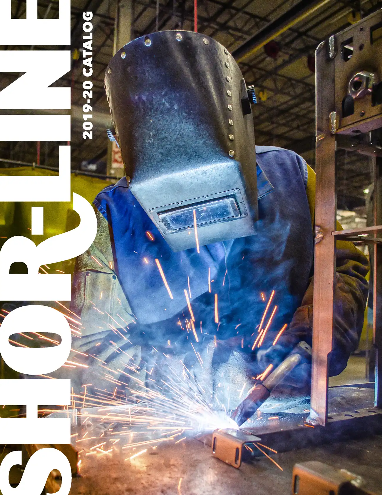
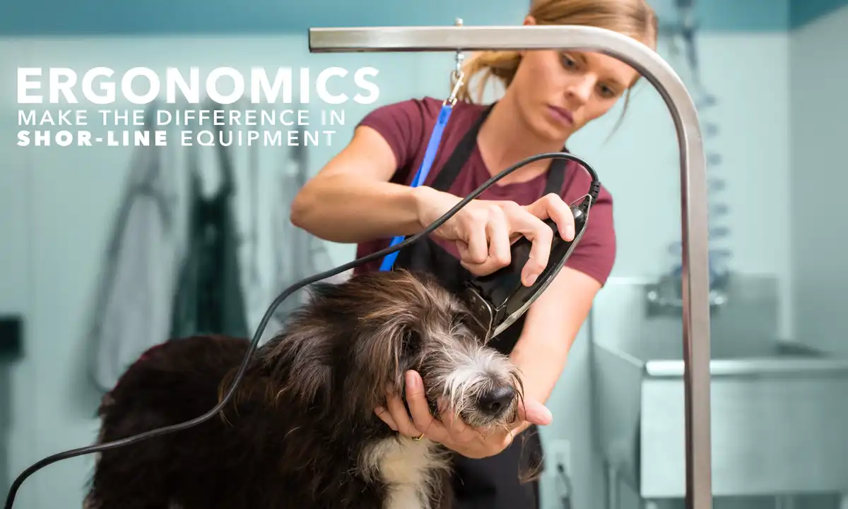
I fully rebuilt Shor-Line's 100+ page catalog by creating a comprehensive design system. Building a new grid structure, typography standards, and tabbed navigation brought order to their extensive SKU portfolio spanning tables, kennels, and cages. Using InDesign's Book feature, I directed a team of three designers to execute the system while maintaining consistency at scale. For the cover, I photographed and art directed a celebration of their American manufacturing heritage, then specified softtouch lamination with spot UV to make the welding sparks physically tactile—reinforcing quality through both visual and haptic experience. The catalog served as both a trade show marketing tool and sales resource for veterinary and boarding facilities nationwide.

Skills: Design systems, team leadership, art direction, print production, InDesign

Cage Wraps

Shor-Line needed to showcase their new 4-color vinyl printing capability for veterinary kennel systems at trade shows- major upgrade from their previous solid laminate and bare stainless steel options. Using halftone grids and CMYK ink drips as the visual theme, I developed a playful meta-reference to the printing process itself that would immediately communicate the customization possibilities. The first wrap uses dramatic process color drips for maximum impact, while the second demonstrates how veterinary practices and shelters could create branded environments. Both designs were printed on demo units for veterinary trade show displays.

Skills: Visual communication, concept development, Adobe Illustrator, brand applications

A World of Steel

Researching the workers and steel infrastructure of the late 19th and early 20th centuries, I compiled and rewrote content from multiple historical sources into a cohesive hardcover publication. The tactile metal-textured cover reinforces the industrial subject matter, while screw-post binding provided both structural integrity and thematic resonance. I developed experimental spreads built on an underlying grid system with narrow columns that echo steel beams and period newspaper typography. Each layout to complemented the historical content, while the pairing of Baskerville and Rockwell conveys the strength and precision of steel construction. This alowed typography itself to dominate without competing graphic elements.

Skills: Information architecture, content strategy, typography, grid systems, publication design

LED Web Banner

Designed digital advertising for Shor-Line’s first LED exam light launch in veterinary industry publications. I integrated the product directly into the typography—replacing the I in LIGHT to maximize visibility while maintaining visual interest. Cool brand colors (blues vs. orange) reinforced the LED’s temperature benefits, and I advocated for cleaner, more modern layout despite pressure to include heavy copy. I photographed and retouched the prototype unit for use across multiple banner sizes.

Skills: Layout design, typography, product photography, photo retouching, Adobe Photoshop, Adobe Illustrator

Ergonomic Grooming Arm

Photo of Shor-Line ergonomic grooming arm

Created product campaign ad for Shor-Line’s redesigned ergonomic grooming arm targeting professional groomers. I photographed the product in-use in a working grooming facility, then applied selective color treatment—desaturating the background to teal while maintaining full color on the product and subject—to direct viewer focus without losing environmental context. This approach created visual hierarchy that kept attention on the key message and product feature while the lifestyle setting reinforced real-world application, and provided clean negative space for headline placement without requiring full background removal.

Skills: Art direction, environmental photography, color grading, visual hierarchy, photo compositing, Photoshop

Professional View Magazine

Created a magazine concept exploring view camera photography with a focus on making technical content visually engaging for enthusiasts. I developed a flexible grid system that balanced dense technical copy with strong visual moments—using large hero product photography, pull quotes, and selective typographic treatments to create rhythm and break up text-heavy spreads. The cover design featured a frosted transparent overlay with grid markings that mimicked a view camera’s ground glass, with my photography underneath as the featured image. Corner bracket elements throughout referenced traditional cropping marks, creating a cohesive visual language tied to the camera format itself.

Skills: Editorial design, typography, layout systems, grid design, InDesign